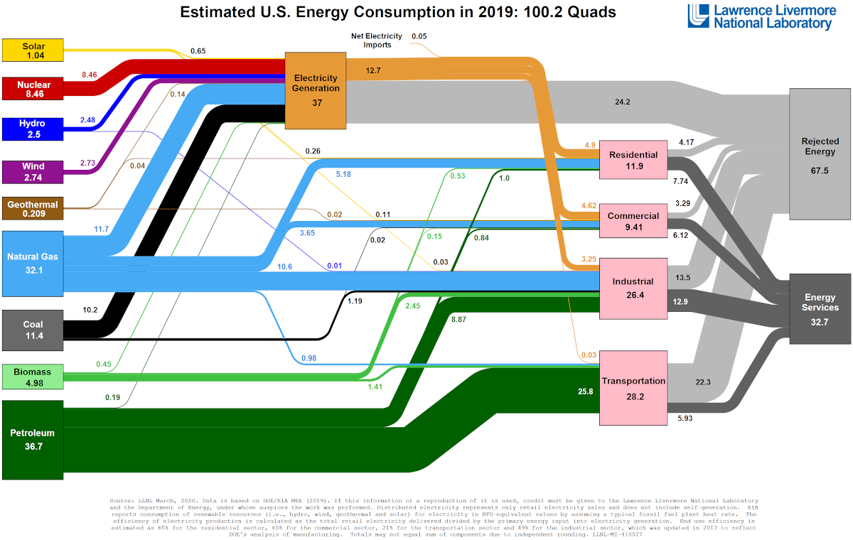
Visualizing America’s Energy Use, in One Giant Chart
May 7th 2020 11:25pm EDT

Visualizing America’s Energy Use, in One Giant Chart Have you ever wondered where the country’s energy comes from, and how exactly it gets used? Well now, thanks to Visual Capitalist’s Jeff Desjardins, we have the answer as The Lawrence Livermore National Laboratory (LLNL) crunches the numbers every year, outputting an incredible flow diagram that covers […]
Promote it on DissentWatch!
- To advertise this post for $0.02 per visit send bitcoins to the address below
- The post will be promoted daily via social media & our "Featured News" display in multiple places
- You can add more anytime
- Ranking order in the Featured News box is based on the balance remaining
Received: 0 mBTC (0.00 USD)
Spent: 0 mBTC (0.00 USD)
Balance: 0 mBTC (0.00 USD)
The amounts above may be lagging behind. If you just sent a payment click below to get more up to date results and push the post to the "Featured News" box faster.
